
Just yesterday Google rolled out a hefty algorithm change that will put an increased emphasis on mobile usability as a key ranking factor.
People don’t have the patience to scroll over, expand the screen and try to determine what the meat of the page is on those tiny smartphone screens. They are just going to click the back button and try out your competitor. For the companies who get it, this is a huge opportunity to add value to their customer experience and win new business in the process. For those who don’t, I hear there are some cool new animated gifs they might want to try out.
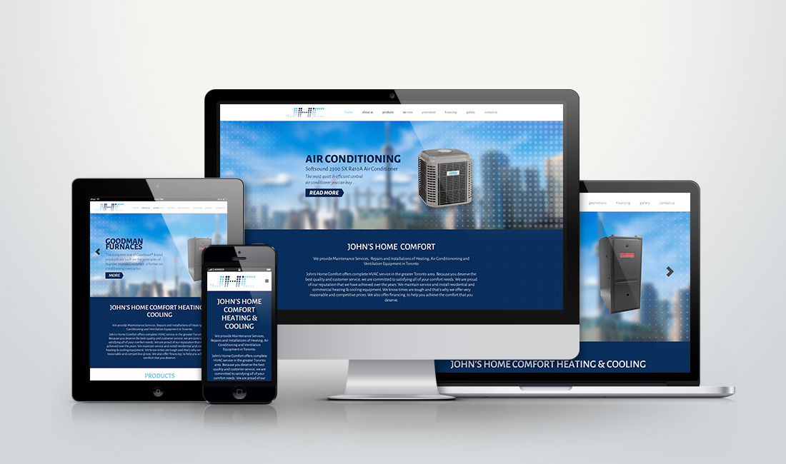
Now we know Google hates non-responsive websites on par with cruddy link spam. We’ve also established that your visitors have you on an extremely short leash, but are we asking the right questions? After all, if a website converts, shouldn’t that be what truly matters? It’s time to ask that critical question — do responsive websites actually translate into higher sales? Let’s dig into the raw data and determine if the responsive design really is the hat trick of web development.
Put yourself in the customer’s shoes. Can you navigate those tiny drop-down menus? What about picking a different shirt pattern from those minute color swatches? Can you even get back to the website once you land on the terms and conditions page? Trying to force a traditional website into a mobile environment puts hurdle after hurdle in front of your potential customer that ultimately leading to the abandonment of the sale.
Responsive design, as we did for Samuel Kleinberg, doesn’t just boost sales. The Aberdeen Group looked at a bucket of customer engagement metrics including brand awareness, average order value, and company revenue. The year-over-year results showed significant improvement across the board. Conversion rates were 8% higher with responsive design (10.9% to 2.7%). Brand awareness increased a whopping 30% (34.7% vs 4.8%)design. There wasn’t a single category that didn’t see significant gains after the responsive design switch.
When it comes to SEO, can a responsive layout increase the chances of a website succeeding in the SERPs?
Google Loves Responsive
And since Google is the divine being you’re trying to impress with your website, it is wise to pay attention to what Google loves. Google not only recommends RWD as the best way to target mobile users but also favors mobile-optimized sites when presenting results for searches made on a mobile device. This is especially true when mobile users search for local services.
One Website, One URL
Building a separate mobile website does have a few benefits of its own, and in some cases creating a standalone mobile version works well. If a website features a lot of content (a news site, for example), a responsive version of the website could soon become the “scrolling version”, with users having to give their index fingers a serious workout just to navigate through the content. This is where a mobile site, with content that has been carefully refined for mobile browsing, can come in handy.
Responsive Helps Combat a High Bounce Rate
Even if a website is sitting pretty in search results, if it doesn’t work effectively for mobile and tablet users, the bounce rate will be a big problem. Mobile websites can suffer from a high bounce rate if the content they offer is too stripped down, or too dissimilar from the content offered on the desktop site. Google will interpret this high bounce rate as a sign that a website isn’t offering relevant content to users, which is likely to lead to a drop in rankings.
User Experience is Enhanced
Websites are essentially a tool for sharing content. A user-friendly site makes it easier for visitors to find, absorb, and pass on this content. Above all else, the responsive design places an emphasis on designing for the user – and with user experience being a big ranking factor, it makes sense that Google is encouraging developers to embrace RWD.
Responsive design helps modern websites appeal to modern users; users who are increasingly likely to traverse the internet using a mobile or tablet device, but who still expect their desktop experience to be as smooth as ever. Going responsive is the most effective way to make the most of mobile and tablet traffic, and to offer visitors the best possible user experience.